BlackBerry Torch: Initial thoughts -- I'm a big fan

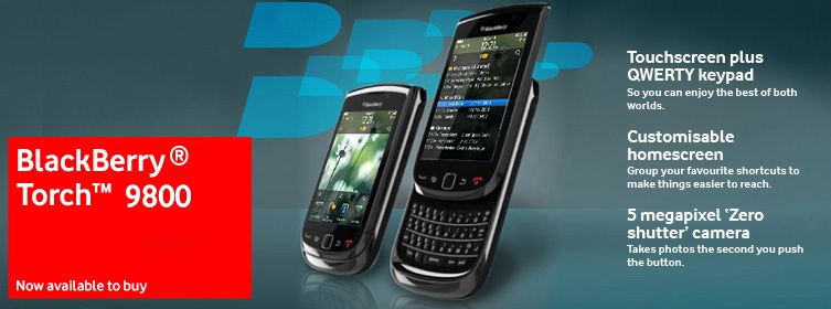
I have to say I am thoroughly, thoroughly enjoying using the trial BlackBerry Torch that RIM sent me the other week. I wasn’t sure if I’d take to the double-UI (i.e. the touchscreen along with the physical keyboard) but I have to say, I’m finding it something of a revelation.
Initial reactions:
– I like flipping the keyboard up to use — it feels very satisfying
– I like the fact the keyboard is much thinner than on my Bold 9700 — it feels easier to grip
– I rarely use the touchscreen to enter text
– I like using the touchscreen in combination with the keyboard — e.g. I’ve found it quicker to delete messages using the touchscreen ‘X’ rather than using the physical keys
– BlackBerry OS 6.0 is a lot nicer — I like the nice transitions and I like what they’ve done to the browser and the email system (brought it into the 21st Century)
– I love the one-touch access from the home screen to the WiFi/Bluetooth/Operator status — very convenient
– The message summary page (that lists the latest emails, appointments, chat messages, twitter messages and so on) is brilliant, really brilliant
– I really do feel like a connected mobile warrior with the Torch
– The super-app integration is simply brilliant (e.g. Twitter, Facebook, LinkedIn) — so much so that I’ve actually been using the native apps more
– It’s hugely satisfying when using a phone … because of it’s size — I always like a phone that at least meets my mouth rather than looking like I’m talking into my hand
I’ll do more on it soon.
(Meanwhile you can pick one up from Vodafone UK today.)


