Daybridge: The calendar app we've been looking for?

I have been following Kieran McHugh on Twitter for a while now. I don’t quite know for how long… it feels long. Long enough to occasionally catch updates from him that were useful, entertaining and stimulating.
And then he went and launched Daybridge.
Manage your time, not your calendar
That’s the concept behind the app. Yes, it’s a calendar app, but one that’s built from the ground up to help you manage your time.
If you’re like me, you have, at some point, decided to really organise your day and whether you’re using Outlook or Google or whatever, you do your level best to try and make it work. And it’s useless.
One of the examples on the site’s front-page indicates helping you plan to catch flights, properly. When I used to live in Copenhagen, you could literally arrive at Car Park 7 and be on the plane in about 15 minutes. But then leaving the Nordea office in Stockholm, via the Arlanda Express train, really needed you to leave about 60 minutes until you were on the plane. I used to travel with the SAS Plus priority boarding service and it was a total breeze. (Those were the days, eh?) But. But. Planning things on your calendar was more or less a nightmare. Trying to explain to Outlook that I wanted to allow 25 minutes to get on the plane… or trying to explain that it needs 45 minutes at a push to get to Stockholm Arlanda from the office… pointless.
I used to setup the calendar with all these 15 minute, 35 minute, 55 minute appointments… useless. Because it looks a complete sodding mess when you try and consult it.
Because you didn’t stick to the rules – the golden rule we all know – that meetings can either be 30 minutes or 60 minutes and everything else doesn’t fit the interface.
And trying to add anything that isn’t a bog-standard proper business appointment is a nightmare. Reminders, ideas, prompts… you can do it with these other calendars. But the interface designers really don’t want you to do this.
There is, I suppose, some weird beauty in a fully committed Outlook calendar day. But no.
I have been peering over the Daybridge screenshots and explanatory text and I am excited. I haven’t tried it, yet. But I want to like it. I want to be someone who uses that product. So Kieran is half way there already, as far as I’m concerned.
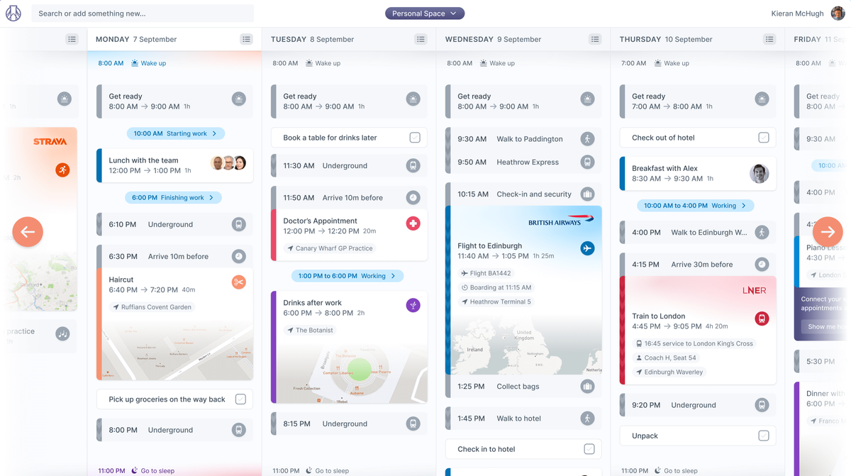
Insert obligatory screenshot here:

Oh and did I mention it’s got infinite scroll? That’s interesting. Very interesting. Of course we need that, as end users, but it feels like such a smart, new concept. Why do I only have 16 x 30-minute boxes to use for organising my business day in my standard calendar? Because that’s how the user interface designer intended it.
Or because nobody bothered thinking until Kieran got out his thinking pencil and knocked up the concept.
It’s a completely different take on organising your day – I really like all the different widget concepts and the smart thinking about how you’re likely to want to make things work for you across a day.
So bring it on. I’ve signed up for more news on the site – as I think a billion other people have done after the awesome TechCrunch post announcing a highly respectful GBP 700k fund raising. Very sensible, too. You can do a lot with 700k – it’s a great number – it keeps his equity sizeable and gives him a ton of room to invest in some good cloud tech and a limited number of really fantastic people. Passion Capital get a decent foot in the door to help advise and grow the business and there’s a lot of room left for the $10m Series A in March 2021 and then the $50m Series B… at the end of next year 😉
If you’re even half interested, go and sign-up for the Daybridge updates and they’ll email when it’s ready for public consumption.
Good luck Kieran – I love the ingenuity.


