Eating your own dog food? A review of the GSMA's MWC15 website
Today’s guest author, James Roswell, is founder and CEO of 51Degrees, a company which provides mobile web optimisation services to more than 1.5 million web sites globally. In the following post, James takes a look at the GSMA’s own website to see how it performs from a desktop and mobile perspective.
Over to James.
– – – – –
Mobile World Congress (“MWC”) is the largest industry event of the year taking place in Barcelona from 2nd to 5th March 2015. The event is so vast it spreads over 2 locations and 8 halls. It takes 20 minutes to walk at a fast pace from one end to the other. Planning is essential.
Mobile is in the title, so one would expect the digital services to work on mobile phones. Even more so since 5 years ago Eric Schmidt gave a keynote advocating “mobile first”. Here’s how just one service, the exhibitor list, performed on desktop and iPhone and what I’ve already learned from MWC15 a few days before attending.
Exhibitor List – Desktop
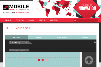
On arriving at mobileworldcongress.com the exhibitors list is selected. Three little red dots draw my attention flashing expectantly. Nothing in that area to see so I scan around the page. I’m looking for mobile marketing companies that I’d like to catch up with so select the products tab and type, “marketing”. Nothing appears. Humph.
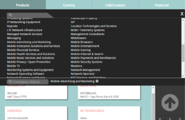
Pressing the little cross clears the text and I have a list of options to select from. I scroll down looking for “marketing”, and then the list disappears. Weird!
After several more attempts I eventually find “marketing” under “mobile advertising and marketing”. Clicking this starts to give me some results and I can scroll through exhibitors.
This wasn’t a great experience, but I found what I wanted eventually. It would have been nice if the text search had picked up the right result given it’s prominence in the user interface.
Now let’s try the same enquiry on an iPhone 5.
Exhibitor List – iPhone 5
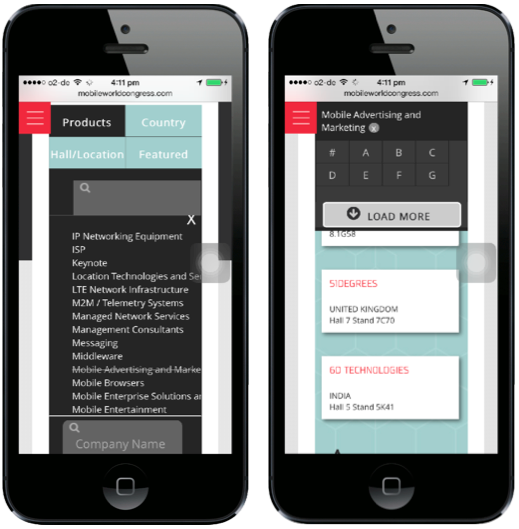
Arriving at the same page immediately results in 1/3 of the screen being taken over by the Mobile World Congress logo and menu button. No little red dots to tease me this time.
No wait there they are. I just needed to swipe down.
I’m already familiar with the general layout from my desktop experience. I tap the products tab and now things start to go wrong.
The search box appears, as does the list of product categories. I know not to use the search box, but I can’t read the list of categories. They’re truncated due to the narrow width of the screen. I swipe down the list and find something that might be marketing. However the text is so small that I struggle to be able to touch the right one. After several stabs at crosses to remove the incorrect selection and categories I select it.
I can now swipe down and view a list of exhibitors. Hurrah.
What have I learnt?
MWC is an expensive trade show ($749 just to attend, $4,999 for a platinum pass and exhibitors pay many times more). Exhibitors spend small fortunes making their stands look and feel impressive. The web site used to find them should reflect this effort and quality. Money can’t have been the barrier. What was and why is it seemingly so hard to produce a great web experience for a process as simple as finding exhibitors?
Incomplete data and wrong systems
Structuring data and meta data (data that describes other data) in the right way to support a great user interface is essential. Choosing shorter category names and reducing the number of them would have improved usability. If the number of categories are needed then a hierarchy of major and minor categories would have supported quicker selection.
Introducing a tag cloud, now common place in digital content management systems, would have provided an even simpler selection method.
Enabling predictive search to find keywords would have also been a nice feature.
I’m guessing the GSMA use an exhibitor management tool that wasn’t designed with mobile web sites in mind and this legacy compromised the features that could be delivered on the web site.
Mobile last
The small font size used in the list of categories and the small text boxes suggest that the solution was designed for big screen desktops, mice and keyboards first and then shoehorned onto the small screen device.
Often mobile first experiences can look sparse and introduce annoyances when expanded to larger screens. This could be avoided by producing different navigation controls for big and small screens making the most of the screen space and input methods available. Such an approach would have quickly allowed a different navigation approach to be used on the small screen, whilst retaining the slightly more usable big screen variant.
App first
The MWC web site also promotes an offline application which provides similar functionality to the web site. The app shares some of the problems with the web site, such as the length of category names being truncated. However it’s a far slicker experience taking roughly ½ the number of taps and swipes of the web site to achieve the same result.
As the app supports 3 different operating systems the GSMA have had to create 4 different versions (probably more considering screen size) of their exhibitor list. This has resulted in at least 2 different mobile user interfaces.
Again I’m guessing but budget was split and probably multiple people or agencies used to produce different solutions. This isn’t an approach that will lead to consistent design. Better to combine as much as possible, particularly user interface design.
Buy not built
There must be many organisations that produce white label event web sites. They are experts in the field and are able to test user interfaces and design approaches across 1000 of events a year. The GSMA has a handful.
If one doesn’t exist then maybe there’s a gap in the market for a holistic digital event solution covering administration, web and mobile?
GSMA Leadership?
The functionality I’ve explored is only a small fraction of that which is available on the web site, and which the GSMA offers. The experience whilst functional was clunky and confusing. Had I not already been familiar with the quirks of the user interface I would have struggled more on mobile. This is not a problem unique to mobileworldcongress.com, but I expect the GSMA to lead the world by example when it comes to mobile. Maybe someone will have a word with Mark Zuckerberg next week and get his input for 2016.
– – – – –
Thank you for that James! I agree: I don’t think it’s too much to expect the GSMA to lead!
About the author
James Rosewell is Founder and CEO of 51Degrees a company which provides mobile web optimisation services to more than 1.5 million web sites globally. The device detection solution at the core of 51Degrees solution is the fastest and most accurate available. Maintained by a professional team more than 200 new web enabled device are supported each week, offering more than 200,000 device combinations in total. 51Degrees open sources solutions are available for Node.js and all other popular web platforms.


