The full UK Palm Pre review: webOS is where things get exciting
It’s been just over a week since I took loan of a Palm Pre, a device that bears the weight of Palm’s future success on its shoulders. Or so the story goes.
And it’s far too good a story for most pundits not to have written, me included. The truth, of course, is a little less dramatic but significant nonetheless.
While the Palm Pre is undoubtedly the company’s comeback device, the big bet is the accompanying webOS that powers the Pre along with the subsequently released Palm Pixi. In fact since the second device running webOS was unveiled, Palm have announced that, moving forward, they’re dumping Windows Mobile to pursue a single OS strategy. Thanks Redmond for easing the transition away from the dying PalmOS to the newly born webOS. But make no mistake, that’s all you were good for.
It’s in this context that when reviewing the Palm Pre it’s more tempting than usual to consider the phone’s hardware as separate from the operating system it runs on. So that’s exactly what I’m going to do.
(Spoiler: The hardware is OK but webOS is where things get really exciting.)
Hardware
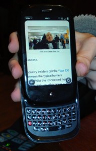 As iconic as the iPhone’s industrial design has become, the Pre largely attempts to carve out its own distinctive cues unlike the raft of ‘slate’ copycats churned out by LG, Samsung and others.
Aside from the portrait slide-out and arched QWERTY keyboard (more on that below), when closed the device follows the natural lines of a pebble or so the marketing fluff goes. Think chubbier and heavier than the iPhone and with curvier lines to match.
It’s also smaller in width and height due to housing a 3.2 inch (rather than 3.5) multi-touch capacitive touchscreen. That’s MULTI-TOUCH and CAPACITIVE. I hope Nokia is reading.
The overall effect is that the Pre is really comfortable to hold, much more phone-like if you will, although it could be a tad lighter.
In terms of build quality, the Pre is certainly plasticky and the slide mechanism does wobble a little but I haven’t found it to be the deal breaker that some reviews have elevated it to. However, this particular Pre seems to suffer from the loose battery problem that others have reported online, which means that the phone occasionally shuts down involuntarily. (Tech historians will know that a very similar problem plagued the original Palm Pilot PDA). The remedy, apparently, requires the contact pins to be bent back into shape or the insertion of a thin piece of foam below the battery.
Next up, let’s deal with that QWERTY keyboard.
I’m disappointed.
It’s not that it’s rubbish but it’s definitely a bit of a let down. I want to love it, I really do as it ticks so many boxes. It’s a real keyboard. It’s portrait not landscape. And I have no issue with it being a slider.
But as much as I’ve practiced, I still can’t get up to the typing speeds I achieve on my Nokia E71 or a BlackBerry or even an old PalmOS-powered Treo. The keys on the Pre are too stiff and the top row too close to the protruding edge. There’s also not enough error correction built into the software and no auto-completion either, both of which could have helped to mask the keyboard’s deficiencies. However, for those who like me don’t get on well with an onscreen keyboard, it’s still preferable having a real one.
The Pre’s call quality proved to be good, although the speakerphone is a bit shrill, and despite O2’s reputation for having it’s network hammered by iPhone users, data connections held up well. I also haven’t experienced any problems joining various WiFi hotspots.
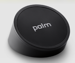 In terms of battery life, the Pre is probably its own worst enemy, such is the device’s always-on and multitasking capability (see below). That said, there’s certainly room for improvement. With moderate use of WiFi for web browsing, 3G pulling in email, a few tweets and calls here and there, you should be good for a full day. The temptation, of course, is to do a lot more, more of the time, in which case you won’t want to be too far away from a charger. However, this is where the utterly brilliant Touchstone comes into play.
The Touchstone is the Pre’s optional (and pricey) desktop ‘inductive’ charger. To charge the Pre you place it face up onto the Touchstone – it snaps into place via a magnet – and the device ‘wirelessly’ begins charging. The phone also sits at a slight angle, perfect for viewing emails and incoming messages while the Pre’s battery is getting a top up. Of course, unlike a certain popular smartphone, the Pre’s battery is also user swappable, so carrying a spare is another option.
The Pre’s camera is mediocre. It’s 3 megapixels and fixed focus, with a single LED flash. There’s no dedicated hardware shutter button – it’s a purely onscreen affair – and like most smartphones, the camera app takes a few seconds to launch, after which, however, shots can be taken in fairly quick succession. In summary, picture quality is passable but the Pre is certainly no camera phone. This is most evident by the complete lack of video recording capability.
To summarize the Pre’s hardware, Palm have made some really smart design choices. The non-iPhone copycat design, the bright 3.2 inch capacitive touchscreen, multi-touch, a physical portrait QWERTY and the optional Touchstone ‘inductive’ charger. But execution, in places, is poor. The wobbly slider, sub-par keyboard, and smallish and poor fitting 1150mAh battery immediately spring to mind.
However, the Pre’s software or specifically webOS tells a very different story.
Software
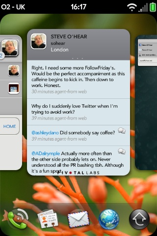 I’m going to shoot from the hip. Based on its ease-of-use and in particular the way multitasking and notifications are handled, Palm’s webOS has the best User Interface of all current mobile operating systems. It’s a contentious thing to say I know and I’m admittedly discounting Maemo 5 as the N900 has yet-to-be-released but I have lived extensively with all recent flavors of Symbian S60, Windows Mobile, Android, iPhone OS, INQ and a whole bunch of dumbphones.
OK I’ll admit that getting to grips with webOS takes a little longer than iPhone. Yep, all ten seconds longer, less than the time it takes to actually sit through the interactive tutorial that ships with the Pre.
The additional learning curve mostly involves getting up to speed with the gesture area and the card system that webOS uses for multitasking. Otherwise, the Pre borrows many of the UI ideas that we first saw on the iPhone, such as kinetic ‘flick’ scrolling or the use of an inverted pinch to zoom in on web pages, images and other documents. There’s also the usual grid of app icons and these, like the iPhone, can be re-ordered and organised across multiple screens, accessible by swiping left or right.
It’s all perfectly finger-friendly, as you’d expect, and the visible feedback given with each finger press in the form of an onscreen ripple is particularly helpful.
One of the most refreshing aspects of webOS is that essential toggles and settings are brought to the surface in the form of a dedicated app for each instead of being buried in one gigantic kludge of a menu S60-style. Examples include discrete apps for WiFi and Bluetooth, adjusting screen brightness and time-out, and toggling GPS on and off. Accessing preferences within each app is also consistent via a finger optimized drop down menu. The result is that I rarely wasted time hunting for a particular setting, something that can’t be said of most mobile OSes.
The card system employed by webOS to support multi-tasking is GENIUS.
It’s one of the UI designs that is deceptively simple and after you’ve used it, you’ll find it hard to go back to the old way of doing things. To switch between running apps, you press the hardware menu button and the Pre zooms out to display each instance of a running app as a card side by side. You then swipe left or right until you’re focused on the card displaying the app you want to switch to, tap on it and webOS zooms in and that app is brought to the front. It’s not dissimilar to Mac OSX’s Expose feature and is almost identical to the way Safari Mobile on iPhone handles switching between open web pages.
Notifications on webOS are equally well thought through. For example, when a new email or text message arrives, no matter what app is in the foreground, a notification area pops up at the bottom of the screen. These can then either be acted upon, such as reading the full email, or dismissed with the swipe of a finger. If there is no interaction after a set period of time the notification is minimized. It’s a very efficient but non-obtrusive system. Far, far better than iPhone’s push notifications and and still an improvement over Android.
A flagship feature of webOS is the way it plays nice with third-party Cloud services, something Palm is calling Synergy. That means syncing with Gmail, Google Contacts and Google Calendar, along with similar support for Facebook. I’ve found Synergy to be reliable and, as noted previously, dead easy to setup (see my Day One impressions: “In some ways the webOS-powered Pre is the Google phone I was always hoped Android would be”).
Palm’s biggest issue with Synergy, however, is that it’s no longer a unique feature. Almost all of Palm’s competitors are now offering or talking up a unified address book that pulls in and converges data from Facebook and other Cloud services – HTC, INQ, Motorola,Google (Android 2.0) and Vodafone (360).
The latest version of webOS also adds LinkedIn to the list supported by Synergy but the UK is currently at least one iteration behind.
You read that right.
Despite getting the Palm Pre three months after the US, we’re saddled with an out of date version of webOS. Palm plans to eventually offer parity between US and UK versions, but again, we’ll have to wait a while. Currently, along with Synergy support for LinkedIn, UK Pre owners are missing much better cut ‘n’ paste and overall speed improvements. I did, however, find a really nice LinkedIn app in Palm’s own app store.
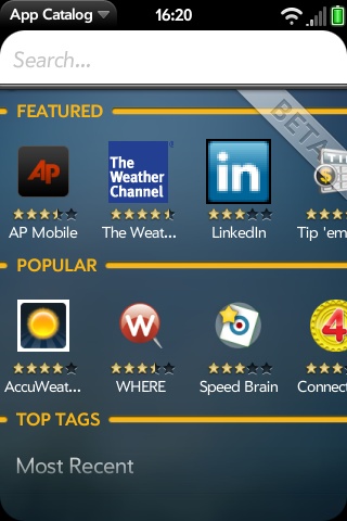 Talking of apps, this is one area where webOS is far behind the iPhone. On the Pre, the app cupboard is fairly bare but it’s slowly filling up a little.
The two questions I’d ask: does the Pre have 1st or 3rd party apps for the features you need? What does the future look like? i.e. is webOS attracting developers?
As for essential features, for my own needs the Pre has most apps covered. YouTube, fantastic web browser, push email, Twitter client, weather, Google Maps, Flixster (movie reviews), PDF and Word viewer, Instant Messaging, Podcasts etc. I’ve also noticed many new apps being added on a daily basis, even in the week or so that I’ve had the Pre.
By the way, the webOS web browser is very, very nice, at least on par with the iPhone, which helps to fill some of the gaps in third-party apps e.g. Facebook.
I also think webOS will/is attracting developers in sufficient numbers and I’m very optimistic about the future of third-party apps. For evidence look no further than the vibrant homebrew community that, like the iPhone’s original jailbreak development community, started before Palm released an official Software Development Kit. And about that SDK, it was only made public and widely available a few months ago. Palm also recently made two smart hires to boost its developer relations.
In other words, it’s early days but on the app front the signs are good.
And that pretty much sums up webOS. It has a very bright future if technology and UX is to win through. Whether or not Palm can sell enough webOS devices to remain cash positive in the meantime – the Pre is a good start and the Pixi should do well – only time will tell.
I do hope so.
– – – – –
Steve O’Hear is a tech journalist and consultant based in London. Steve writes the blog last100 and has written for numerous publications, including The Guardian, ZDNet, ReadWriteWeb and Macworld. He also wrote and directed the Silicon Valley documentary, In Search of the Valley. You can follow Steve on Twitter here.

