ImpulsePay: One simple way to fix The Cloud's silly mobile payments system
Last night I published a request asking for suggestions for companies that could replace the utterly dire payments check-out/gateway system used by The Cloud.
I can’t quite believe that The Cloud’s product management team or their executive team allowed the existing system to go live in it’s present state. You can read about my crazy experience trying to sign-up to their service here.
So I publicly invited any alternative payment providers to drop me a note with their ideas. The first to respond was Paul Paterson, Operations Director at ImpulsePay.
Here’s Paul’s email:
Hi Ewan,
Hope you’re well! I read your story last night on the nightmare you had trying to pay for the Cloud and wanted to suggest an alternative they could use.
To me the solution seems very simple… mobile payments. Of course I would say this as I work for ImpulsePay (www.ImpulsePay.com), the leading provider of Payforit, but bear with me.
In a situation like the one you were in last night a mobile payments solution is the perfect fit. Not only does it allow you to pay directly from your mobile, but the payment process is designed for the mobile screen. You wouldn’t have had the issues you had with fields not fitting onto the page – but then again you wouldn’t have needed to fill out all those fields as payment could have been made with just a couple of clicks.
We have worked very closely with the operators to develop Payforit and it now offers merchants a wide variety of options, such as subscriptions, one-click payments and a comprehensive dashboard.
As an example of how it is used, about two years ago we were approached by Nomad Digital, the providers of the onboard wifi infrastructure for Virgin Trains and CrossCountry trains. They had exactly the same problem, too many people getting to their credit card payment portal and giving up. In that particular case they also used WorldPay (and still do), but were looking to complement this with a much simpler way for passengers to pay.
After testing our Payforit solution they decided to roll it out to all 76 Virgin trains, eventually adding it to all CrossCountry trains as well. The result? The mobile payments option is now the most popular option by far.
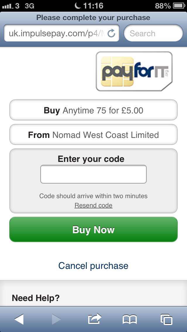
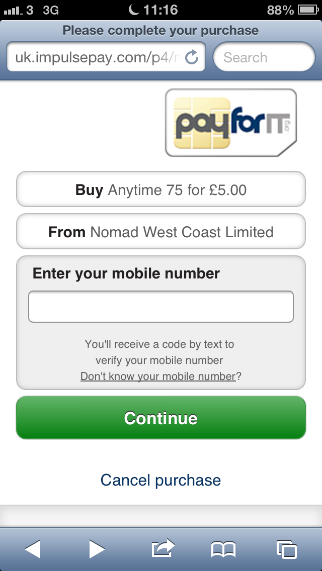
I’ve included some examples of the payment screens – as you can see, they’re quite different to the ones you were presented with last night!
The great thing about Payforit is that you don’t need to be on your mobile to pay as it can also work for people buying online – you just use your mobile number to make the payment instead of your credit card.
We actually did some testing a while back and found that, on average, it takes over 120 keystrokes to enter your credit card details. I’d imagine it would have been much more looking at those payment screens. Coupled with pages that aren’t optimised for the mobile screen, it’s easy to see where the problem of consumer drop-off lies.
I’d be happy to chat to you about this in more detail if you like.
Thanks
Paul
Here are the screenshots that Paul references:
Thank you Paul! That looks like an excellent solution — and given that you’ve done it for a similar service (Virgin/CrossCountry) it would certainly work for The Cloud.
(If you’re a payments provider like ImpulsePay, or if you represent such a company — and you’d like to write me some suggestions on how you’d improve the existing mobile billing setup used by The Cloud, drop me a note just like Paul did and I’ll get your contribution up. I’m ewan@mobileindustryreview.com.)
(I should also point out that I’ve no agenda here beyond being stunned at the ridiculous payments process offered by The Cloud — I was genuinely trying to sign-up to their monthly service.)
