**UPDATED ** LGPradaWatch: The fashion phone’s sequel ** UPDATED **
At the press launch, we spent some time with the handset to get a good enough feel for it, see how it works, what features it has and how it performs.
We covered the basic features of the phone in another post, so there really isn’t any need to go over old ground.
The first thing the more astute of you will notice is the phone looks exactly like the first LG Prada handset. In fact if the two were put together you’d be hard pushed to tell them apart.
The only real difference one might notice is the new LG Prada phone is a tad thicker, as you’re undoubtedly aware by now it supports a keyboard this time around.
LG and Prada both mentioned at the press event they did consider other designs. This more or less said to us they do have an imagination, and weren’t just riding the bandwagon from the success of the first model.
Both said they kept coming back to the original exterior and then finally settled on that once again. Although we’re sure there’s a thought behind this somewhere surrounding the idea of creating an iconoclastic phone design. Perhaps LG and Prada jointly are aiming to establish a brand, a look and a feel for an exclusive designer mobile series. Don’t forget this has worked for others in the premium handset market, just look towards the Motorola RAZR as an example.
We suspect that this will not be the last phone to have the same look and feel of the original mobile. Perhaps the next model should be a flip phone/clam shell in the range, with a similar exterior? Well, we’ve seen their full touch screen handset, and now a smart phone – the next just seems obvious.
How the mobile feels in your hands is very much different to how it looks, as it does appear to have a designer aesthetic minimalist edge to it. When in actual fact it’s really light, and feels really cheap and very plasticy – not at all what you would expect. Perhaps we’re spoilt of late with quality builds such as the HTC Touch Diamond or the Sony Ericsson Xperia X1. The handset does come off feeling like a cheap, non exemplary, un awe-inspiring mobile phone.
It’s very disappointing when you hear of two legendary forces coming together to make a phone like this, only to be let down in just how it feels. As a lot of people will base their opinions on first impressions on how it looks, and the tactile response on first contact. One of which I’m afraid sadly let us down.
The screen is fairly sharp and easy on the eyes with its 3-inch QWVGA 240 x 400 display. The handset supports the likes of DivX playback; although we didn’t actually see this in action we were told on good authority this shows the screen off well.
Working your way around the OS shows how responsive the handset really is. The chipset is Qualcomm, running Brew as its OS with their own UI on top. This is supposedly capable of handling 7 applications comfortably running all at once, which we put through its motions to a degree and all was well.
Before we delve deeper, two things we came across at this point troubled us. We first discovered there was only 60MB of onboard storage and the battery was only a 950 mAh Lithium Polymer. Not much wiggle room in terms of capacity or a massive battery life. One is expandable to 8GB and most likely comes with a 1GB microSD card, the other is not so easily resolved.
They’re quoting 400hrs on standby and 3hrs talk time. This means to us it probably won’t even last an average day in use. Even the likes of the Xperia X1 has a 1500 mAh battery, which we’re not pitching it up against but it’s almost the same form factor and could last nearly twice as long in use.
Its browsing experience isn’t the greatest and we found it a chore to use. It’s not the most friendly to navigate. You can however install Opera Mini on the LG Prada and from what we saw makes a whole lot of difference. On the plus side the accelerometer is fully integrated and works well with everything we tried, including the browser.
There were two configurations of the UI we saw on the day. The one we pictured in an earlier post was the black lettering on a white background; the other was just the reverse. We chose the first one for the screen shots as we knew it would show up much more clearer. But the other one to be honest fits more with the phone.
From the main home page, you’re presented with a start screen much like we see on the latest Samsung mobiles. With access to a clock, some widgets and possible calendar functions or internet search.
There are actually three main screens to choose from on start-up. The other two are a basic screen with the carrier and the Prada logo. With the last providing access to the most common functions, such as: messaging, phone calls, calendar and their ilk.
These can all be accessed from each other by pressing one of the three dots at the top of the page, or by swiping your thumb from left to right on the screen. Now, it’s here that HTC should get interested.
As this way of moving from screen to screen and the way it morphs/changes is the very same way the first HTC Touch changes from menu to menu. This was then its niche and the unique feature it was marketed and sold by. When we first saw this, our immediate reaction was this is a little too close for comfort, and then we looked around the room for any HTC lawyers. None were to be found.
We listed all the other menu options in the photos the other day, so no need to go back and repeat all of that. One thing we will say is that these are presented as all being virtually laid out from corner to corner with each other, in an interesting way too. Where you can move between them all, by going from corner to corner. Think of them as all being laid out on the largest sheet of paper an A0, where all of the menu options are on A2 sheets. Where four of the A2 sheets make up an A0. You can move between the by going from 1-4 of the A2, sliding your thumb between edge to edge.
This is a way of laying these out we hadn’t seen before, when seeing it in action it simplifies all the menus of the phone. OK, it seems a little odd to spend so much time discussing the menu navigation of a mobile but it was impressive. So much so, you wonder why other handsets do not have this already. We’re sure it would clear up so much confusion to many, who do get bamboozled by such a complex structure.
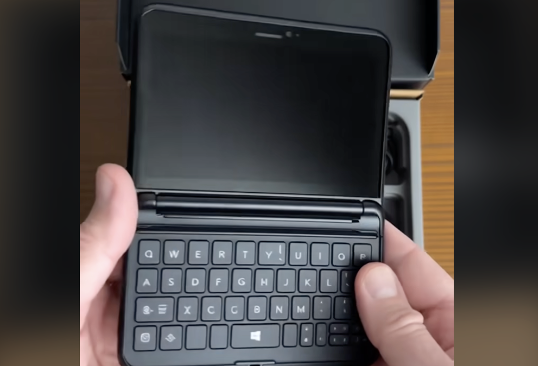
Lastly, the keyboard. Having spent some weeks with the HTC Touch Diamond and another length of time with the Sony Ericsson Xperia X1, we’ve become accustomed to handsets with QWERY keyboards. So typing on such a beast, with a new model of a phone is always of interest.
What we can say about the LG Prada is that it puts the others to shame. It was just a simple delight to type upon, and at some speeds too. Characters weren’t missed, letters weren’t dropped, and words were picked up as if typing on a full laptop or PC keyboard.
The keyboard is laid out much like SE X1, with small keys separated by a good millimetre in between. Instead of there just being air between them all, they are reset into the keyboard itself. So to type you have to press down. Much like you would do on a button as the keys recesses into its housing. All in all this gives it a pleasurable experience in typing, unlike others mentioned so far.
For 600 Euros, the phone does seem rather expensive. Some of the features won’t sell itself to new customers who aren’t fashion conscious, others including its name will. The built quality for us comes off like it’s a demo model found in a shop, with no working parts inside. Others we spoke to on the night didn’t concur, including those at ShinyShiny whose opinions we value. Perhaps we’re being overly critical, see for yourself when it arrives later this month in shops.


