More updates to Mobile Industry Review
I had another field-day this evening with sodding cascading style sheets on Mobile Industry Review.
Eventually I just stuck in some tables and woosh, it worked. I will arse about with the CSS to try and make it work another time.
Here’s the latest update:

I’ve split the news stories down the left and made a central column for stuff like our upcoming events and the latest MIR Show episodes.
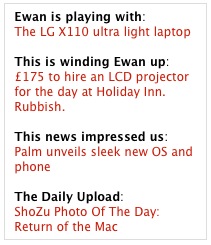
I changed around the top right-hand box again — that we added last night — and made it 100% content focused:

We’ll aim to change that content weekly — apart from the daily ShoZu bit.
For the heathens still running on 1024×768 resolutions, I changed the width back down to 950 from 1010 pixels yesterday. It should work now.
Quick fact? 23% of the MIR audience run their systems on 1024 pixel resolutions. The vast majority — 63% — use resolutions much higher than this with 1280×800 being the most popular (25%), followed by 1280×1024 (15%).
Still lots of work to do on the site. If you’ve any recommendations, shoot me a note.


