Nokia N97: The Whatley POV
So, the Nokia N97 eh? What do you think of THAT?!
Me? Hmm… Well, you all know what I thought of the last Nseries I laid my hands on and so when it comes to the newly announced Nokia N97, I approached with a certain amount of trepidation…
And my initial impressions? – I’m maybe just a little bit excited…
(but maybe not for the reasons that you’d think)
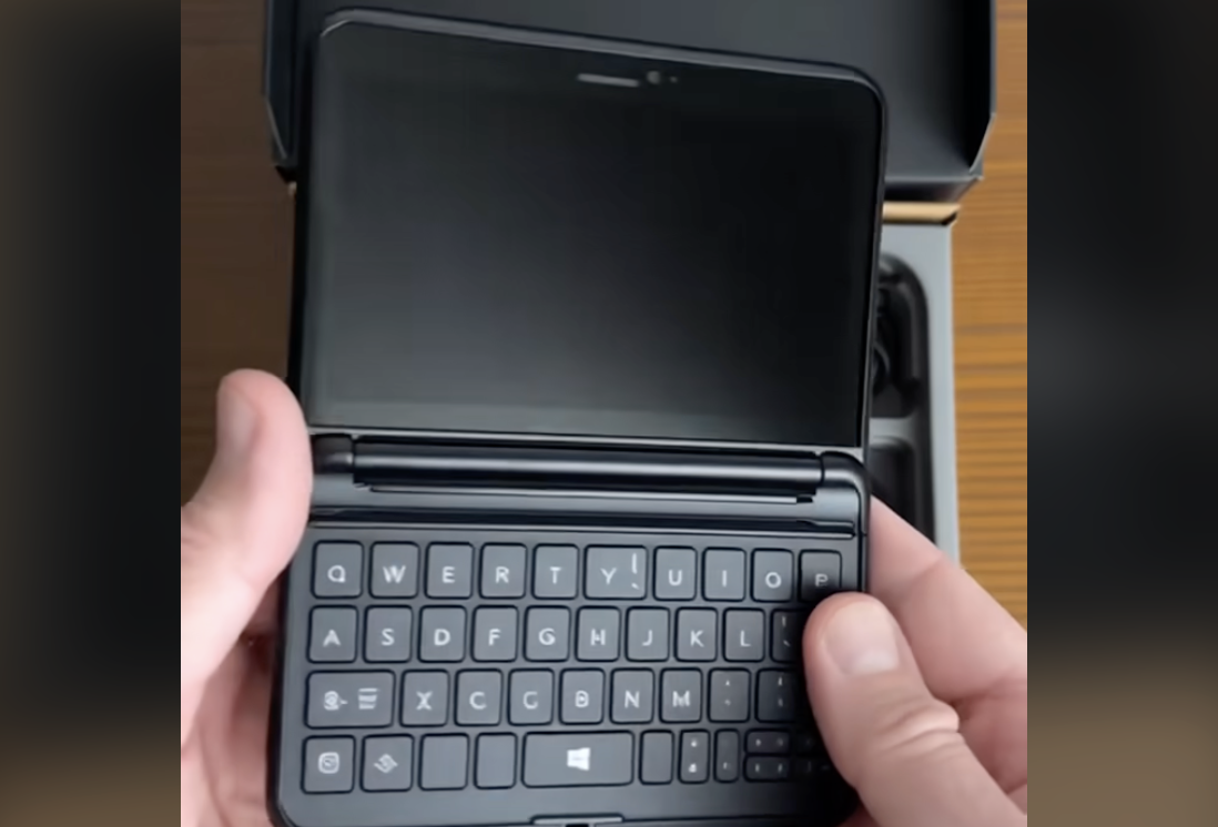
At first glance the N97 looks like the lovechild of the E90 and the Nokia 5800 but from the outset the QWERTY keypad looks like it’s not too dissimilar from that of the Eseries sister device, with the only change being the directional pad shifting from the right to the left side of the keys…
it’s worth pointing out this far into the piece that I am yet to actually get my hands on this device, SpinVox commitments keeping me in Blighty for this year’s Nokia World, (more on what’s been keeping me so busy coming up soon), so my thoughts and words are totally and utterly my initial gut reactions/impressions from specs, reports and pictures that have been flying out of Barcelona since late last night…
Moving on…
The touch screen UI, S60 5th Edition for those that care, is perceived to be the same as that in the Nokia ‘Tube’ device that we saw launched earlier this year as part of the Xpress Music range with key DNA from both that and the E90 shining through so far so we’ve got one massive multi-combo mash-up of a device…
However, you could argue that there’s nothing new here.
You could argue that yet again Nokia have failed to innovate.
That Nokia have merely put two and two together and are hoping they hit four, not five – *cough* Like they did with the N96 *cough* – but again, and in complete polar opposite to the the N96, and as I mentioned at the outset – this device actually excites me.
Yes, the form factor is new and is certainly interesting; One of the G1 characteristics that I actually enjoyed the most was the ability to flick the screen up at any point you got bored/annoyed with the touch screen and do things properly as it were, so the addition of the full keyboard under the screen is a welcome feature here on the N97.
The camera is 5MP – standard fare for Nokia flagship devices although; interesting to note that they [Nokia] are not, as yet, leaping on the 8MP bandwagon that Sony, LG and Samsung seem so keen to pursue.
The music – With echoes of the Xpress range being in abundance, the Nokia N97 will of course support Comes With Music (fingers crossed anyway – yes Vodafone, I’m looking at YOU) when it arrives and, if the music quality is anything like the 5800, then Nokia will have that sewn up too. With a WHOPPING 48GB of storage space, (32GB onboard, 16GB expandable memory), I must admit that filling that bad boy up with content is going to be a struggle for even me…
Parking all of that to one side, is there still no real innovation? Is it ‘just’ evolution.
Not that this is a bad thing mind, the N95 8GB was a great ‘evolution handset’, the N97 it seems is another step forward from Nokia (not sideways, or even backwards – again, I refer to the N96).
One thing needs to be made clear right here and right now:
I firmly believe that the Nokia N97 is the replacement for my N95 8GB.
..and here’s why:
One of the great things I love about my N95 8GB is the way it keeps me constantly connected. Constantly. As Ewan Spence quite rightly pointed out,
“Staying in touch seems important to James in his choice of applications. Many of them are concerned with getting information off his device and onto the internet, either to small social groups, or to individuals. Within two or three button presses, Whatley is off communicating to pretty much anyone he chooses. The smartphone for him is all about getting the word out.”
The more data I can consume the better. Anyone who’s seen me at any conference anywhere in the world this year knows that I just don’t carry my laptop anywhere. My E71 and my N95 8GB give me all the connectivity, information and data sharing functionality that I need.
The N97, with its brand new ‘widget homescreen’, presents a real opportunity to get things right; One of my favourite features of Apple’s iPhone is the main menu and homescreen being one and the same.
The N97 looks like it could be going down that route… and then some; Pulling in information from RSS feeds, Share on OVI (although I’m hoping this can be swapped out for Flickr), Facbook, Email etc…
This is the active standby screen that dreams were made of.
Obviously, to keep things in perspective, as with any Nseries device – the proof is in the pudding. More often than not these devices arrive with shoddy firmware that is slow, buggy and prone to freezing/crashing. I’m still researching into the N97 and will no doubt have a follow up piece in the works very soon, but I’m crossing all my fingers and all my toes that at last Nokia may actually launch something with final (or at least half-decent) software.
For the time being at least, the queue for the N97 starts here.
Get behind me folks – we may be here a while.
Whatley out.


