Nokia's N9: The full release (you need to read it)
Now then, this release is critical reading for anyone following the mobile industry.
This is the launch released regarding the Nokia N9 — in full.
First of all, read it.
Don’t read it critically. Don’t think about platforms, don’t think about brands, just try and ‘take it in’ without making the usual judgements we all do about Nokia at the moment.
Then I’ve got some comments below for your perusal.
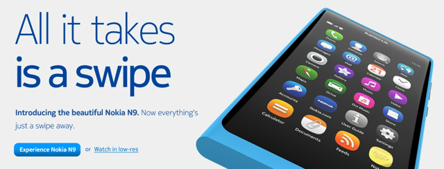
Singapore – Nokia today announced the Nokia N9, built for people who appreciate a stunning blend of design and the latest smartphone technology. To learn more about the design of the Nokia N9 visit: http://swipe.nokia.com
One swipe and you’re home
The Nokia N9 introduces an innovative new design where the home key is replaced by a simple gesture: a swipe. Whenever you’re in an application, swiping from the edge of the display takes you home.The three home views of the user interface are designed to give fast access to the most important things people do with a phone: using apps, staying up to date with notifications and social networks, and switching between activities.
The industrial design of the Nokia N9 is an example of extreme product making and craft. The body is precision-machined from a single piece of polycarbonate and flows seamlessly into beautiful curved glass. The laminated deep black display means that the user interface just floats on the surface of the product.
The Nokia N9 also packs the latest in camera, navigation and audio technology for a great all-round experience.
“With the Nokia N9, we wanted to design a better way to use a phone. To do this we innovated in the design of the hardware and software together. We reinvented the home key with a simple gesture: a swipe from the edge of the screen. The experience sets a new bar for how natural technology can feel,” said Marko Ahtisaari, Nokia’s head of Design. “And this is just the beginning. The details that make the Nokia N9 unique – the industrial design, the all-screen user experience, and the expressive Qt framework for developers – will evolve in future Nokia products.”
Innovative all-screen design
With no need for a home key, the all-screen Nokia N9 makes more room for apps to shine. The 3.9-inch AMOLED screen is made from scratch-resistant curved glass. The polycarbonate body enables superior antenna performance. This means better reception, better voice quality and fewer dropped calls.Camera, maps and multimedia
The 8-megapixel Carl Zeiss autofocus sensor, wide-angle lens, HD-quality video capture and large lens aperture enable great camera performance even in lowlighting conditions. This makes the Nokia N9 one of the best camera-phones ever produced.The Nokia N9 features free turn-by-turn drive and walk navigation with voice guidance in Maps. With the new dedicated Drive app, you can get in your car and start navigating to your destination right away.
You can watch videos in true 16:9 widescreen format. And because the Nokia N9 is also the world’s first smartphone with Dolby® Digital Plus decoding and Dolby Headphone post-processing technology, you get a surround sound experience with any set of headphones.
Touch just got better
Fitted with the latest in wireless technology, Near Field Communication (NFC), the Nokia N9 allows you to easily share images and videos between devices by touching them together. Pair it with Bluetooth accessories like the new NFC-enabled Nokia Play 360° wireless music speaker only once, and you get a great surround sound music experience with just a tap.Colors and Memory
The Nokia N9 will be available in three colors – black, cyan, and magenta with storage options to accommodate plenty of content: 16GB and 64GB. The Nokia N9 is scheduled to be in stores later this year, with availability and local pricing to be announced closer to the sales start.More information about the Nokia N9 can be found at: http://swipe.nokia.com.
Right.
Ok. If you read this release properly, chances are your attention was piqued.
The new ‘swipe’ concept is — at first glance — flipping hot. Or hawt, as people far cooler than me say. No home key? Finally. Love it.
A completely new user interface? Very cool.
Nokia’s famed — and I do mean, famed — robust industrial design team allowed to get stuck into their expertise? Anything with the words ‘polycarbonate’ and ‘curved glass screen’ deserves further investigation. Interesting.
A proper 8 megapixel camera? Yes — this is a reminder that whatever handset you’re currently using, unless it’s got a Carl Zeiss lens, it’s camera is shit. Especially if you’re using one of those top of the range Android or Windows Phone devices with ‘amazing cameras’ that seem to capture everything as though the lens is made out of dough. Yes, there’s one thing Nokia do really, really well: Imaging.
True 16:9 widescreen? Interesting. You know it does get rather annoying watching movies and TV shows back on my iPhone 4 and finding black bars all over the shop unless I ‘tap-tap’ to zoom in. In which case I feel like I’m missing out a bit.
Oh and it’s a Nokia, so the telephone gubbins actually works and I won’t sound like a muffled arse (hello iPhone!) speaking to folk? Well, that’s getting compelling.
But what’s missing from this press release?
If you’re anything like me, you were scanning ahead of each paragraph, hunting for the mention of the operating system, weren’t you?
Hunting!
I was.
I had to re-read the whole piece twice. Then — I kid you not — I actually did a ‘Ctrl-F’ (or, well, ‘Apple-F’) to find the word ‘MeeGo’.
Wasn’t there.
I also did ‘Symbian’, just to be sure. There were lots of can’t-tell-you-anything smiles at the Nokia UK Press Event last week. This device is probably what they were smiling about.
So it’s MeeGo.
Yes, it’s running on MeeGo. Or, as far as we’re concerned from a public perspective, it’s ‘MeeGo’.
It’s rather fascinating that all those executives in Nokia Central sent this release out to the marketplace without any mention whatsoever of the operating system. Are we getting to the point where the OS is becoming irrelevant and it’s all about the user interface? Maybe. Not quite — but that time is approaching, especially when the OS can properly retreat behind a veil, disassociated — finally — from the user interface. Indeed, I look forward to a time when the user can decide and dictate their own UI layer. Fancy the app-silo approach from Apple? You have it. Want to use a map-based next-generation UI from Nokia? Just click. Or do you like the HTC Sense concept with the nice clouds in the background? Just tap and it’s there.
I think it’s a smart exercise from Nokia, dropping or not mentioning the UI. The more cynical out there will assume or presume this is because the company is aiming to avoid OS attention. No. That conversation cannot be avoided.
The strategy forced a look at the other features first. You know what, when you’re down — as Nokia most certainly is — you can do this kind of thing. You can innovate. Indeed, things get highly exciting when you’re a down-and-out multi-billion dollar company filled with oodles of talented, passionate and super-engaged geniuses. You can start playing by your own rules. This is what I think we’re seeing.
The new UI looks rather swish. I am particular impressed at what I *think* I saw in the video — NFC-enabled touch-to-swap imagery. I think that’s what I saw. I’ll need to enquire.
Why release the N9?
Well, there’s a segment of the market that loves Nokia. That same segment will look fondly on the 16GB version but will obsess over the 64GB version. I don’t necessarily expect Nokia to start selling a-million-a-day but I think there’s sufficient fans out there who can seriously live without Angry Birds. Sorry, I mean ‘apps’. Oh you’ll still get apps on MeeGo. In fact given the inclusion and full support of Qt, it is a literal piece of simplicity to click-click-click and knock out an application for the N9. That will (more or less) also work on a billion other devices.
(‘Billion’ is a bit of dramatic license. But when you look at the possibilities with S40 and S60-Qt enabled devices, there are actually quite a lot of users out there.)
The company needs to keep it’s MeeGo muscles flexing. I’m expecting big things from them over the next few years.
Now watch this video of the N9 and ‘swipe’:
Did you see that NFC-image-swap thing? 45 seconds in? I’ll need to speak to The Blandford about it.
After watching the video — yes — I’d like an N9.
No word on costs as far as I’m aware yet. I’d expect — what — 600 pounds? Something like that.
Good work Nokia.
I’ll have more on this over the coming weeks.


