One user's challenging N8 experience
The Nokia N8 is a brilliant piece of engineering. The camera experience is — of course — second to none.
The actual user experience is tailored to Nokia/Symbian fans. Which is a preposterous situation.
If you’re a friend to Nokia, then the inconsistencies in the experience are perfectly fine. Indeed, if you’re a Nokia/Symbian fan, the N8 can sleep with your wife and sit in your favourite chair, watching your HD TV whilst you’re hard at work. That’s the level of indulgence needed to avoid wondering precisely what the Nokia team were smoking when they let this one out the door.
If you’d like to follow some examples of the glaringly stupid, stupid issues that should have been nuked in QA, check out the N8 Fail Tumblr Blog.
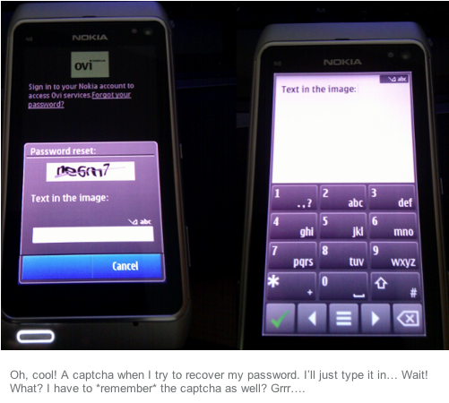
Here’s a good example of the inconsistencies baked into Nokia’s platform. I had to smile when I saw it…

I smiled because — oh dear — yes, a text-area-input does typically require the full screen. That’s just how the user interface functions. Which means, yes, you *do* have to memorise the captcha text. It’s most certainly not ideal. Again, if you’re an indulgent Nokia fan, you’ll totally let this slide.
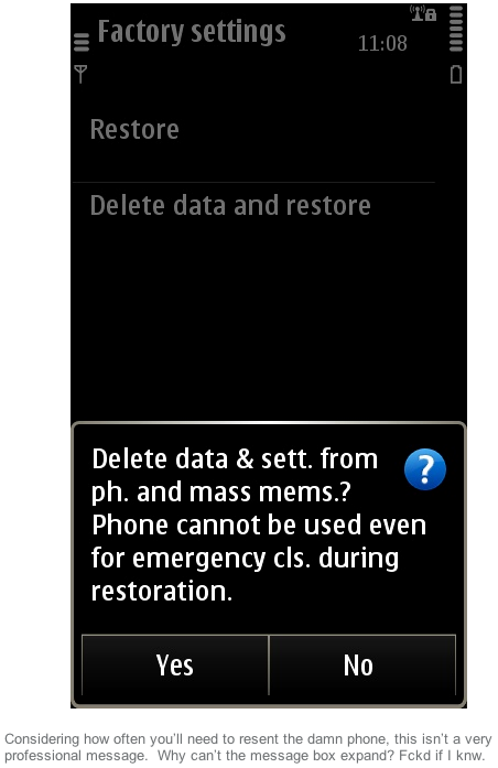
Here’s another one. It’s got me cringing.

You’d think that ‘cls.’ should probably be ‘calls’. Indeed you’d think that whoever managed this particular section of the operating system-cum-interface should probably have put their hand up and said, ‘You know what, we could definitely re-word this’.
Perhaps make the prompt box bigger? Maybe display a screen full of text explaining what’s going to happen, rthr thn mkng the user hv to wrk it out?
I don’t think the Nokia N8 sucks… you just need to be a Symbian/Nokia fan — and be familiar with the platforms idiosyncrasies — for it not to annoy you. Am I right?


