Review: Diamonds shine up better than apples
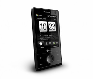
HTC Touch Diamond
Price: € 549, £499.99 – varying from contract to SIM free
Before we begin looking at the HTC Touch HD and their S740, we thought we’d familiarise ourselves with the linage and start from the HTC Touch Diamond for a review.
Seeing as the 3G Iphone has been around now for a while, we thought it could be time we brought you other contenders to its self-proclaimed prestigious touch phone crown.
We spent some weeks with the Touch Diamond during the review process, thoroughly putting it through its paces. Over this period of time, well over 40 emails were exchanged between ourselves and HTC, along with more calls than we care to remember and a handset change. So for your viewing pleasure we proudly present the most notable review of the best selling HTC phone to date.
As a comparison and only for a reference point, the HTC Touch Diamond is a much smaller handset that the latest fruit company phone. It measures up to just being 102mm in length, 51mm wide and 11.35 mm in depth, as compared to 115.5 x 62.1 x 12.3 mm of the Iphone. Making it compact enough to fit into any small pocket, rather than a large coat one which the Apple device seems to be aiming for.
Its actual viewable screen is just over 70mm diagonally, with the golden delicious offering being around 20mm larger. Size isn’t everything though, as the Diamond comes off looking like an Iphone Nano in contrast – if there ever were to be such a beast *cough*.
The screen itself is fairly responsive to the touch, making it easy and simple to use. It’s even clear in fairly bright sunshine, although to be entirely honest we haven’t really seen much of that in Blighty of late so it’s hard to definitively tell. What we did however find surprising is just how messy the screen gets, and how quickly it does too.
After just a very short space of time in use the screen becomes incredibly littered with extremely noticeable and irritating finger prints, just as the case’s rear does too. It’s as if the materials used in the build just seem to gather these for identification purposes by C.S.I. at a later date. Just as an aside here, the retail box arrives lacking any protective cover of any sorts. The original Touch and many of the other HTC ranges are all accompanied by such a case.
Imagine an entire day of the phone being man or woman handled, it becomes rapidly very unpleasant to bestow your peepers upon. As the mess really does obscure and obliterate the screen with all the smudges it gathers en route. A simple cloth based case, like the one accompanying the original Touch would simply clean the screen and its casing whilst being placed in its housing. As its cloth-like interior would wipe away any smudges gathered from all the necessary and unnecessary handling that goes on during the day.
OK, it’s no a real biggy in terms of major setbacks, but it did take us back a tad on just how grubby the handset gets in a very short space of time. In the end this was actually remedied by us in using that very same original HTC Touch case. Seeing as this is their flagship model, you would have thought they’d have sprung for a case. That would cost no more to produce than the flack they’ll get in answering emails as to why there IS no case.
The Diamond is branded as a touch screen phone, but if you weren’t overly enamoured with the idea of such a beast do not worry. Everything on screen can also be actioned from its control pad, which makes up for around a fifth of the phone on the front. It almost offers here the best of both worlds, as it’s a touch screen coupled with a physical way of accessing the phone.
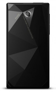
HTC Touch Diamond – rear
Where the Diamonds name originates from is the design on the handsets rear. This supposedly gives off a gem like appearance in its fragmented fractal futuristic faceplate. We believe this entirely falls short in convincing us of its likeness. Instead it comes off much like HTC tentatively feebly grabbing at straws in an effort to allure towards a much more expensive image.
What would have been more apt in our most humble opinion is that every design is of a unique fractal nature. Or if not entirely unique, perhaps every batch produced could be so instead. More recently there have been sightings of other rear-case designs cropping up on various networks, with just a standard plain layout. Perhaps the Diamond’s losing its shine after all.
In terms of processing power, it’s run off the new favourite of HTC – the Qualcomm MSM 7210A chipset. We say favourite as it first appears in this phone, then went on to feature in the new QWERTY keyboard based Touch Pro and then the Touch HD. They also went on to reuse it in two other handsets they’ve made for other companies. As it now appears in their outsourced phones, the Sony Ericsson Xperia X1 and the HTC Dream AKA T-Mobile Google G1.
When it came to the phones memory, we were once again taken back a tad, only this time with its expansion options or the lack there of. Onboard there’s 4GB of addressable storage on moviNAND with no possible room for expansion whatsoever.
Yep, that’s right folks, no microSD slot! Don’t worry, this stunned, shocked and bemused us too. How this was explained away to us was of interest. Their chief innovations officer had a word with us at an event over this exact matter. He said to add a media slot would increase the overall size by 2mm, therefore reducing the cases slim form factor to a much bulkier ordinary looking phone. To be entirely honest a larger case, just to accommodate a card slot wouldn’t have been an issue and would have made for a more substantial phone. In less than 7mm they managed to include it on the HTC Touch Pro with a slide-out QWERTY keyboard too.
Powering on the phone for the very first time is somewhat of an interesting process. First you see a glimpse of what Windows mobile 6.1professional looks like natively, before the overlay of the HTC TouchFLO 3D user interface is literally installed over the top.
This new UI is very comprehensive in terms of presenting the most commonly used applications on the phone, with nearly all of the Windows mobile 6.1 hidden away. This isn’t the case with other handsets we’ve seen from other companies who supposedly tout a similar experience. We’ll shame no names here, but most just look like an added on theme pack
It’s really the second iteration of the TouchFLO UI to be seen, with the first making its debut on the original HTC Touch – launched summer of 2007. Back then it really was more of a small spruce up to Windows than anything else. With very minor functionality added making it a tad more useful. It was then just a simple home screen to the original interface, with access to weather, brightness and a few programs. Along with a few flashy ways to access media and making calls, all very smoke and mirrors we thought. Now, the TouchFLO 3D has really evolved and stands out as a significant addition which has come on a long, long way. We’re sure if separately developed it could even be a contender to Windows Mobile itself.
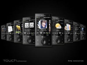
Now it’s a fully integrated touch screen OS, with all the functions usually used being provided by icons at the base of the screen. All of which can simply be accessed by sliding a thumb, with some pressure though, across the screen or even up it. All the options here can be scrolled through, in an easily readable and an accessible manner. These are even presented in a way that could even rival the Iphone layout, so we firmly believe.
It’s going to be a tad tiresome to list all of the apps on the phone; the image above though should provide you with a picture of what’s there without boring you to death. Also, if we begin listing them and the operator you obtain the phone from happens to restrict it in some way, you’re likely to get shirty with us.
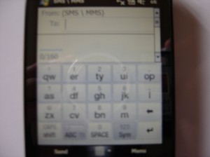
Messaging on the Diamond was a whole new experience to us, we’re unsure if this is due to the TouchFLO 3D or down to Windows mobile 6.1 professional. By default, an onscreen keyboard appears much as you imagine a virtual one would do so from a standard candy-bar phone. Meaning 1 on the keypad equals letters a, b and c with the rest following on in a similar fashion. Only it’s not that simple, the keys now represent a QWERTY pad instead. It’s all very strange and weird typing a message in this way and did take some time getting used to. After a few days it all clicked in to place and going back to something else just wouldn’t make sense anymore.
We weren’t overly impressed by the reception on the HTC Touch diamond. Using a SIM card we had from the 3G network Three in the UK, calls were frequently dropped, connections were often hard to obtain and then to sustain for large amounts of time. Tests were done in the exact same location used with our t-rusty old former wood-pulp-millers E90 phone. All of which worked fine and exemplary in comparison. We even used another Diamond and even had our handset swapped out, all with no positive results. We’re assuming that a tweak by the network would most likely resolve the issue, but it’s a tad worrisome nonetheless. It’s worth noting that Three are the only network in the UK not to carry the phone at present or rebrand it in anyway. So read into that what you will, we have.
During every day usage we came across some quirks and default features that were irksome to say the least. One of which was that after an incredibly short time with the phone not in use the screen goes blank, with no way of tweaking this setting. Only by pressing the power button on again does the mobile wake up for use, with more times than not being unresponsive on first attempt. This gets old real fast and becomes an extreme annoyance. This even happens as soon as a call connects and you’re even unsure when it’s ended as a result. Where this also becomes a real try of ones patience is when further numbers need to be entered on the keypad. With the screen being dead ‘n all it’s a real hassle with voicemail. What’s even odder, if you answer a call with the handset laying on a flat surface, the screen always stays on. We’re really unsure if any of this is a real power saver or not, or just a way to annoy us endlessly.
Another foible that we found bothersome was the charging. There’s no constant light anywhere on the handset that we’re all used to whilst the phone’s attached to a power source. Instead, there’s an eerie light which appears around the control pads enter button, escalating from the base to the top. Only it’s not constant, instead it very slowly pulsates adding to the overall creepiness with an oddly long pause between each cycle. So if the phone’s just glanced upon it could appear not to be charging at all – which we were caught out by many a time, hence the mention.
Then there’s the Accelerometer, the onboard sensor for telling the handset to display the screen landscape or in portrait mode – depending which way up the phone is. Don’t get us started on this. It’s not really utilised at all by the Diamond, in fact almost not at all whatsoever. The built in Opera browser uses it, which was a dream to use we might add. Oh and the picture viewer and that’s about it. Google maps is built in, fully utilising the onboard AGPS and even that doesn’t make any use of it at all. If anything should it’s that, otherwise you’re stuck with an oblong view of everything instead of a nice 16:9 format. It’s a shame when something great like this comes along and isn’t hardly harnessed at all.
There were a whole bunch of other quirks we found, from the phone not waking when an SMS arrives, Geotagging not being enabled from the 3.2MP camera or even the HSUPA. All of which are a part of the phones features and should be enabled. On further investigation we found most of the underlying faults to the phone could be resolved via unconventional registry tweaks. All of which can be found on a great site called xda-developers.com. We hope in future ROM updates they take heed on the sites’ findings and include them.
In an effort to see how the phone would last in a real day situation we put it through its paces over an eighth hour period. We tried to simulate an average day’s usage on a full charge, with exhausting the battery life completely. Over an average working day we made seven 30 minute calls, on the eighth attempt the phone died just after 16minutes. All in all meaning the phone lasted, whilst on a mixture of standby and in calls, 226mins or 3hrs 46mins. Whereas HTC believes the phone will last 3 hours and 30mins talk-time on 3G, or up to 396 hours on standby, which is close enough to make happy but not entirely. A beefier battery has been seen in the wild, an 1800mAh model as compared to the standard 900mAh. This doubles the longevity, but at a cost of a new backing plate increasing its overall beefiness.
We’ve discovered that HTC have released a new somewhat interesting ROM for the phone, but only in Hong Kong. Besides just generally improving some of the overall performance issues, it enables 850 MHz GSM functionality. This effectively turns the Diamond from a Tri to Quad band, which is a part of the chipset anyway. Now we’re mentioning it here as we are hoping it will be rolled out globally and any fuel to the fire can always help. Hint, hint HTC.
Summary
After using the HTC Touch Diamond as a main phone for some time we found the handset does really shine on the whole, none more so than with the TouchFLO 3D. Despite its little flaws, which mostly can be resolved by the adventurous with non standard tweaks – it’s a good all round handset. Perhaps HTC could take a bite out of the Apple market share after all. We just hope HTC are listening, reading and can work upon these fixes for the future.
Good Points
TouchFLO 3D, GPS onboard
Bad Points
A few too many wee niggles to mention
Really bad Points The Ugly
Intermittent reception, no microSD slot
