The E75: Very (very) first impressions
 After only a few hours of playing these are my first impressions for those hungry for news of this device. If you have any questions or comments please leave them below… we’ll post a longer, more complete review in a week or so.
The good:
- Call quality is excellent. Speaker sound from device is crisp and clear.
- The phone has a nice weight. Feels good in hand in ‘candy bar’ mode.
- All the settings options are now behind a ‘control panel’ icon.
- The e-mail client is even further improved over the Nokia messaging version tested with the E63. It has better configuration options and graphics.
- The build quality of the device feels solid and the internal QWERTY keypad has a good rubberised finish which improves accuracy and prevents sliding onto adjacent keys.
- Has a great crisp screen with a nice bright finish which copes well in direct sunlight. Lacks the attractive FP2 transitions that the N86 had though.
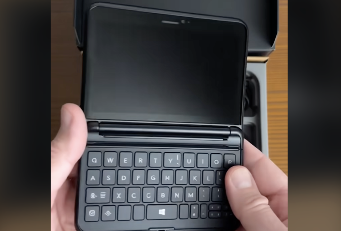
- The slide-out keyboard really has a ‘wow factor’ and impressed colleagues.
- Best of all! The keypad tones are now off by default – the first Nokia I’ve ever tested where this isn’t the first thing I turn off!
The ‘not sure’:
- If used flat on a desk with the QWERTY keypad open, the device falls backwards when the D-pad button is used.
- With ‘tap to silence’ turned on the device only rings for a second or two before silencing (even if untouched on a desk) – could be a bug or user error, will check further.
- No ‘full-stop and space’ feature on space-bar double-tap like the iPhone and Android.
- Camera images are a bit too ‘contrasty’ with some colour over-saturated. So far ‘good enough’, but low light tests will be the decider (see the demo images below).
- No charging via USB port – it’s only just being added to the more expensive N-series devices, but it would have been nice to see.
The bad:
- When using the D-pad in QWERTY ‘mode’ it’s easy to hit surrounding short-cut keys such as Calendar or E-mail. This seems much less of a problem in ‘candy bar’ orientation.
- The E75, like the E71, is still a finger-print magnet – the patterned metal back is already looking mucky after only 15 minutes of handling.
- My unit has a large gap at one end when the QWERTY keyboard is closed. Could be a manufacturing defect (although slide mechanism is rock-solid).
- The memory card slot on this unit is so tight I can’t open it.
- There’s no ‘leather’ sleeve like the E71 and E66 have – it might be a bit naff, but it saved my E71 from a certain death drop.
Overwhelmingly first impressions are good – including (and it’s been a long time since I’ve said this) the software enhancements which are beginning to address some of the usability / complexity issues Nokia and S60 have been suffering from for a while.
Here’s a few camera demo shots in good light. Low-light ones (where most E-series struggle) to follow:


