Vodafone 360: The Dire Maps App
This morning I thought it was time to get stuck into mobile oblivion once again and check out Vodafone 360.
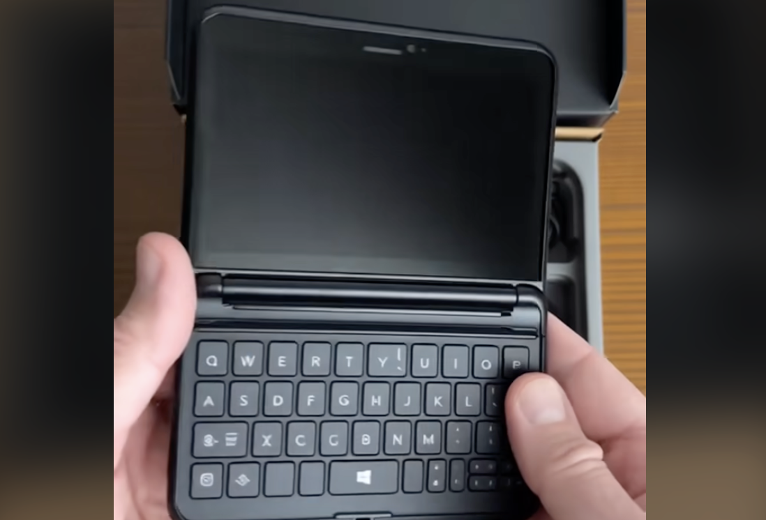
As I walked down to the tube I recognised the now familiar ‘oh shit’ feeling that greets all users of the Samsung H1 Vodafone 360 device: That is, the knowledge that someone might recognise you using the device. There is, unfortunately, nothing else bar a first edition Motorola Razr, that can make you look as unfashionable. Don’t get me wrong, the device itself has a lovely bright screen and looks fairly attractive. It’s the fact that someone might recognise that I’ve handed over my existence to an organisation that thinks it knows best. Witness, for example, the little square friends status layout that will permit you 18 characters of status update. I really like messing round with the squares — but when I was trying to see what Neil Wooding was up to, I couldn’t read his whole message. By default, the first screen only let me read:Struggling to deal…
That got my attention. I clicked.
The little square that popped up revealed:Struggling to deal with content reviews and…
There’s more. But I couldn’t read it. Indeed 360 appears to offer no more functionality in this regard. 7 words. That’s all you get. Choose your word length wisely.
Somewhere I can feel a Vodafone committee declaring, ‘But 7 words is the optimum status update length! We have reports from consultants that specifically state this is the case’ Fat lot of use to me. If I want to read Neil’s entire status update, I need to flick through the couple of hundred squares to find his profile. I know. I tried. I did find him. But he’d changed his status by then. Or. Well, to be frank, I don’t quite know whether I was looking at an up to date status… Anyway. Rubbish. Apologies to those having their breakfast on The Avenue in Chiswick this morning. The person you could hear effing and blinding and slamming what looked like a silver handset into that wall on the corner — that was me. Sorry. I changed my status about four times this morning. Despite having the mobile version of a degree in nuclear physics, I usually have to do what every other (disappointed) customer does frequently when using 360: Guess. Some parts of the user interface are often so confusing you literally need to tap and see what happens. Then watch your frustration rise as the device does exactly the opposite of what you intend. I was trying to switch to numbers on the keypad but the user interface kept wanting to publish my incomplete status. Perhaps they’ve added a 7-word limit function I didn’t know about. What’s severely pissing me off this morning, however, is the Vodafone map function. I set my expectations to ‘fairly bollocks’ and fired up the application. It is dire. The maps would have been really, really good two years ago. It just doesn’t compare to Google Maps. You can actually see the user interface building the map layers. First the river. Now one or two yellow roads. Now some lighter yellow roads. Now a few more bits of green… I’m *waiting*. Why didn’t they just buy it from Google? Why bother re-inventing something that — whatever you claim — doesn’t quite meet anyone’s expectations? Committees. The worst function of the maps app is that other 360 users can shit all over it. I’m scrolling over the West London version and finding little square white icons all over the place. Icons added by (what appears to be) Vodafone staffers. The icons just appear willy nilly. I clicked on one. ‘Bobby Rao’s place #2’ I shit ye not. That’s what it says. What the fluck is that doing there? How does that improve my existence? Why am I being exposed to this rubbish? I click on it and that’s all I get. I’m pleased to see that Bobby can’t quite be bothered to use the mapping function properly on his 360 device either. Committees. Somebody somewhere has been to too many ‘The Future of Mobile Mapping’ seminars and got the wrong end of the ‘user empowerment’ stick. By all means allow users to add notes to and augment their maps. But don’t expose me to them. Unless they are my friends. And give me the function to layer that augmentation on top. Flucking committees. I nearly laughed out loud as I notice a flippin’ large pin with the title ‘VDF Office’. Yes. That’s precisely where we can all go and complain. The concept is sound. Being able to add little square pins to my map for my friends to find/follow, yeah, I like that. But what committee decided to open it up to everyone? What mapping genius consultants suggested this feature? Anyone can add anything? It doesn’t scale. It scales really badly. If someone’s added more than one pin, you see a square in the location with a number corresponding — I imagine — to the number of entries for the location. You can scroll through them but it gets unmanageable after about 10. For the avoidance of doubt, I don’t want to read the pin data for the Great Unwashed. Or at least give me the facility to switch that on and off.Posted via email from MIR Live
Update: I’ve since managed to find the screen that shows you an entire status message. And apparently, I’m told you can switch off the individual pin things on the map. Somewhere. I’m not quite sure where though.


